Our new packaging - the artist's impressions
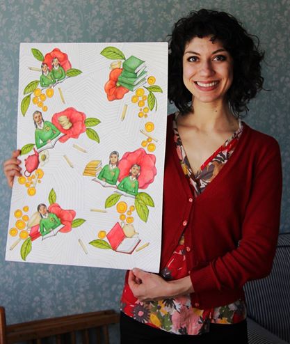
Maria Randall with Tea People mural
Creating an illustration for Tea People’s packaging was a true pleasure. The task of feeling out a mood, message, and brand and trying to create something that will communicate effectively to customers as well as catch the eye and add delight and beauty to a space is exciting and stimulating. It brings together many of my interests and was particularly satisfying because of who Tea People are and how much they care about their cause and the quality of their tea.
They are people who are passionate about their work and are using profit to invest in the education of children in tea-growing regions. That’s a message that was genuinely exciting to try to communicate through branding design.
I had already had the pleasure of tasting many of tea people’s excellent teas before becoming a part of the design project, and so once Gillian educated me a bit about what Tea People’s values are, we began to brainstorm images.
We wanted to bring their interest and value for the women into the visual design. A social message can be heavy or polarising, but I wanted the design to be bright, fun, and whimsical. After all, tea drinking is a social occasion, something to be shared as a part of conversation, hospitality, or celebration. I was initially drawn to the lines in images of hilly tea-plantations, the curves of the long rows of tea bushes as they follow the contours of the hills and valleys. My first thought was to make an stylised or abstracted image of a tea plantation, so that I could include these lines which seemed beautiful to me, and the women which were working on these plantations. But after some sketches we realised that this might emphasise the difference between these women working in far-off places and the people purchasing the tea in Britain.
After lots of conversations—and cups of tea—I settled on an illustration of women having tea parties in the different regions from which Tea People sources their tea. I used curving lines which I had abstracted from the tea plantations that had inspired me, and included little references to the specific regions in the clothes and accessories of the women chatting over their cups of tea.
The result was hand-drawn murals which I coloured brightly. I was happy with the mood in my final illustrations--they are not ‘slick’ or corporate, and hopefully add beauty, delight, and a focus on the people to how Tea People’s brand is communicated visually. The line drawing of the mural is overlaid on bright, rich monochromes for the backgrounds of the new packaging, with the smaller coloured images of the women popping up here and there on the packages, website, and informational material. I can’t wait to hold it in my hands!